Introducing New Social Shopping,
Boosting Engagement for 10M Users
B2B2C / Mobile App / Live Shopping (E-commerce) / New Product / Real-World Project

I created the mobile app UI/UX design for a new live shopping service, combining livestreaming and e-commerce, which was popular in China, to drive adoption of the built-in payment service within the LINE platform, one of Asia’s leading messaging and internet platforms.
- Note: Unfortunately, I can only show a partial section of the work I completed on this project due to privacy reasons.
SKILLS
Mobile Application Design, Competitive Benchmarking, Design Systems, Stakeholder Collaboration and Communication in Agile, UI Design, Design Proposals for Rapid Decision-Making in Verbal Communication
TOOLS
Figma, Photoshop, Project communication tools
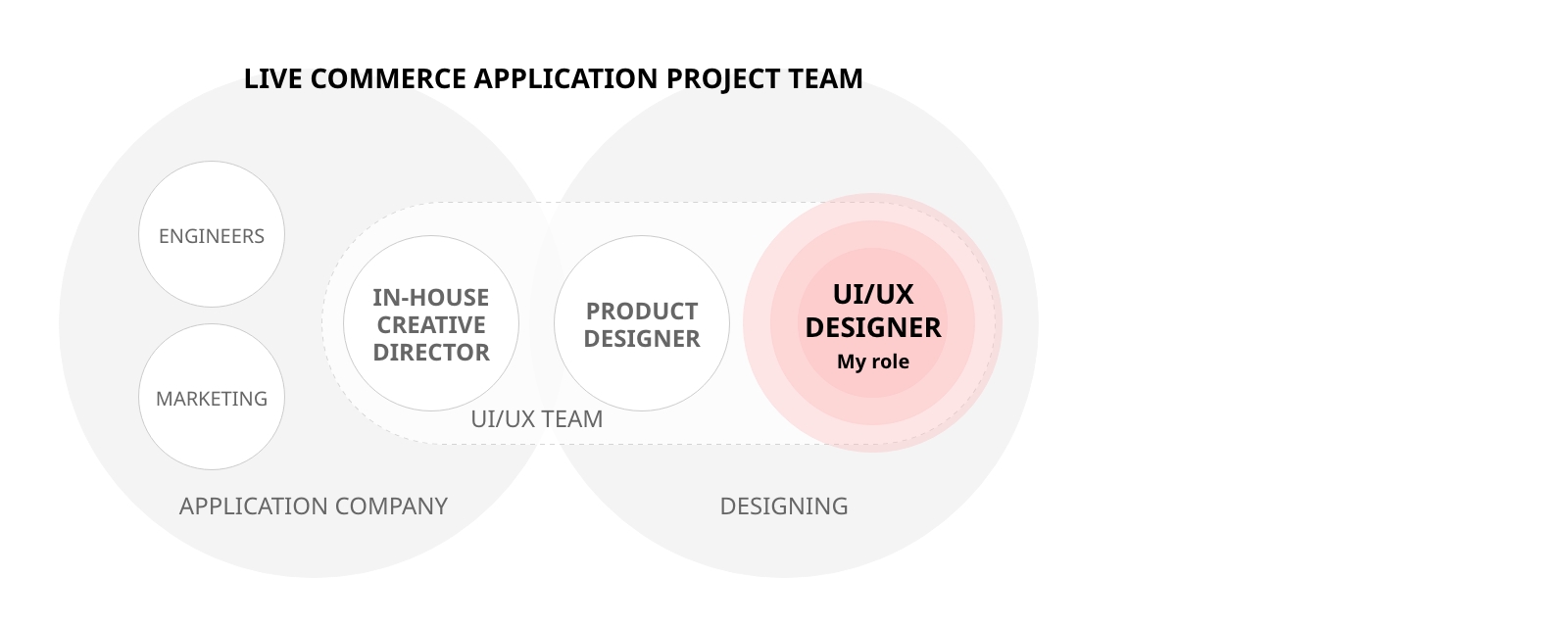
THE TEAM
2 Product Designers including me. 1 Creative Director, Engineers and Marketers from the client's in-house team.
TIMELINE
4 months, 2023
🎯 Business Goals
- Boost engagement by integrating the built-in payment service.
- Drive adoption of the new live shopping experience.
- Create a seamless checkout flow.
👫 Our Users
Target users
LINE has 97 million active users. That’s about 78% of the population in Japan. Our focus is on:
- 20-30s Women: strong digital engagement and high spending motivation in fashion and lifestyle.
- 50s Women: strong purchasing power with established consumption habits.
From a global perspective, live commerce users are on average in their mid-30s, with users in their late 20s being the most engaged.
2 Core user roles
- Key Opinion Leaders (KOLs): influencers who promote products through livestreaming.
- Viewers: shoppers who join livestreams to watch, engage, and consider purchases.
🤝 Key Stakeholders
The project was a collaboration between two companies:
- Client team: In-house team including creative director, designers, engineers, and marketers.
- Agency team: where I worked as a Product Designer alongside other designers and engineers.
🔥 Challenge
Designing a new live shopping experience that fits seamlessly into the existing platform ecosystem, encouraging users unfamiliar with live commerce to confidently engage, purchase, and adopt the built-in payment service.
Research
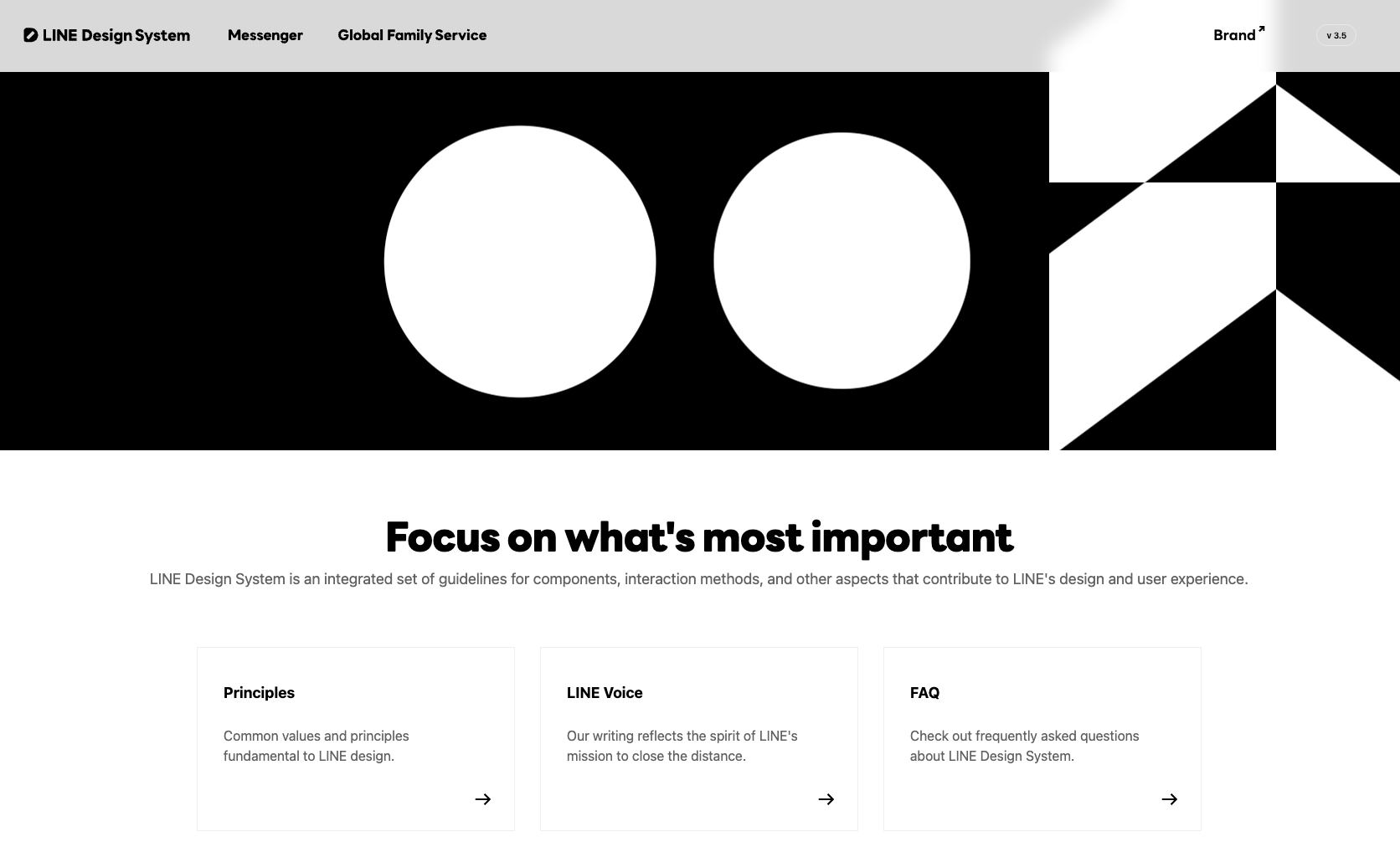
Platform Ecosystem and Design System
Researched the platform’s services (Messenger, Pay, Shopping, News, etc.), design principles, and Design System to understand their UI/UX conventions and how they are connected to ensure consistency. To build empathy and support design decisions with stakeholders, I documented and shared the findings.
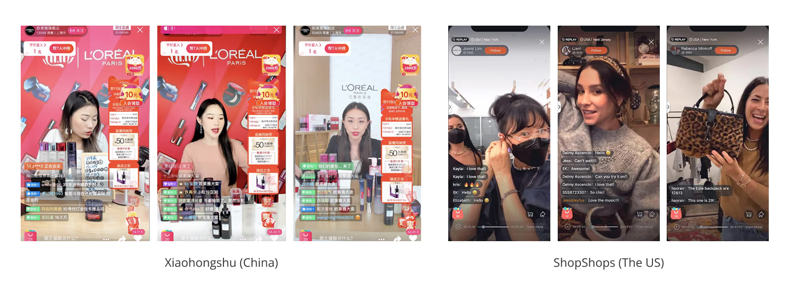
Competitive Benchmarking
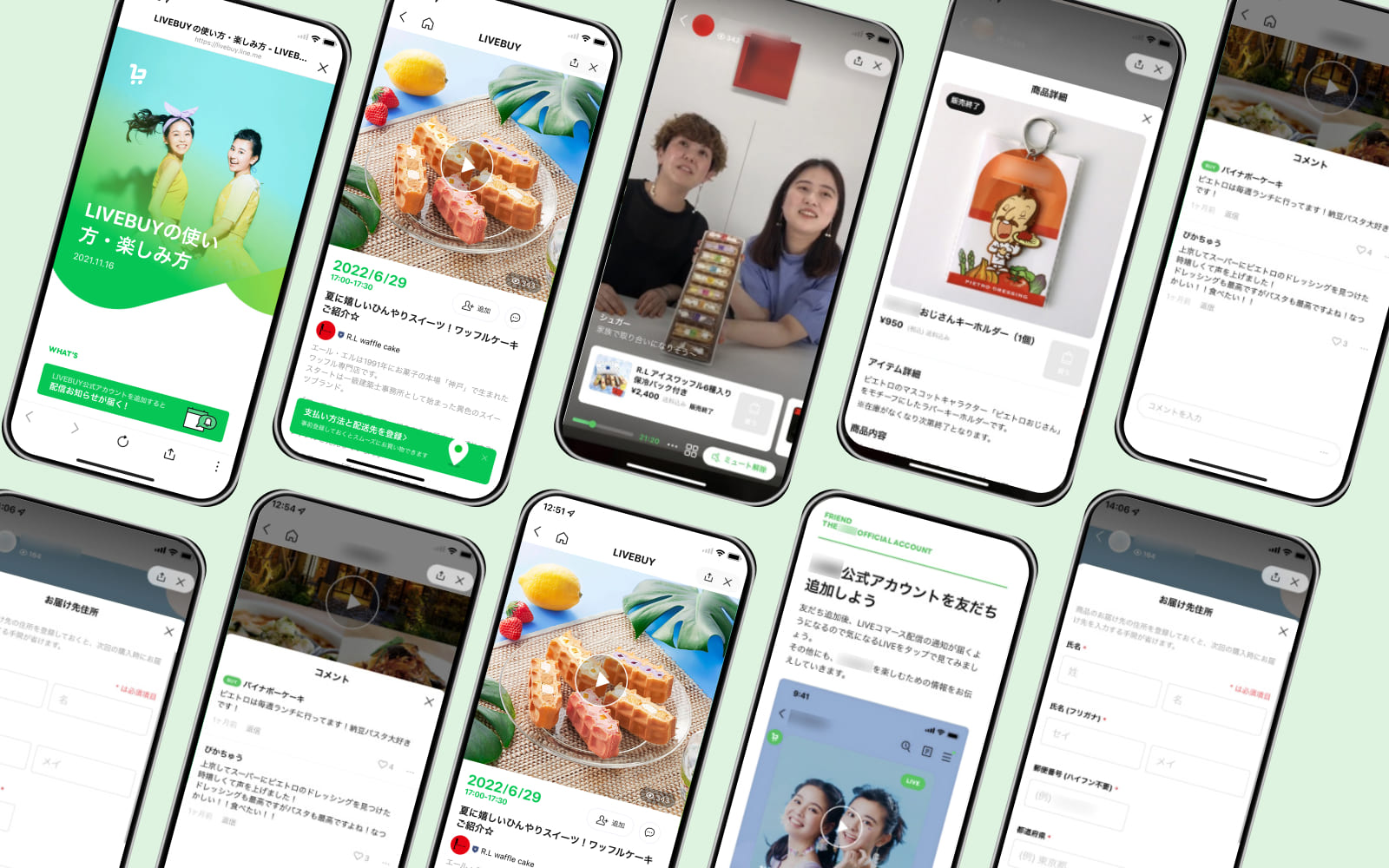
As this service is new to the Japanese market, I conducted competitive benchmarking research, comparing leading apps around the world.

🔍 Discoveries
As I dug into global examples, a few patterns stood out that guided our design thinking:
- Convention pattern: Real-time interaction such as live chats, reactions, and gifting turn viewing into a two-way conversation and sustain attention. This was seen across all major competitors.
- Urgency boosts conversion: Platforms like Taobao and ShopShops thrive on countdowns and limited-time offers that nudge people to act fast.
- Effortless checkout: Payment flows across competitors were familiar and consistent.
- Balancing clarity and energy: While Chinese apps pack the screen with dense information, U.S. apps keep things minimal. For Japan, we needed to strike the right balance—interactive and bold enough to be exciting, but still clean and easy to follow.
🚀 Process
The project followed a sprint cycle. We held daily meetings with designers and weekly meetings with other stakeholders. With internal designers and engineers, we maintained constant communication and remote collaboration through chats and calls.
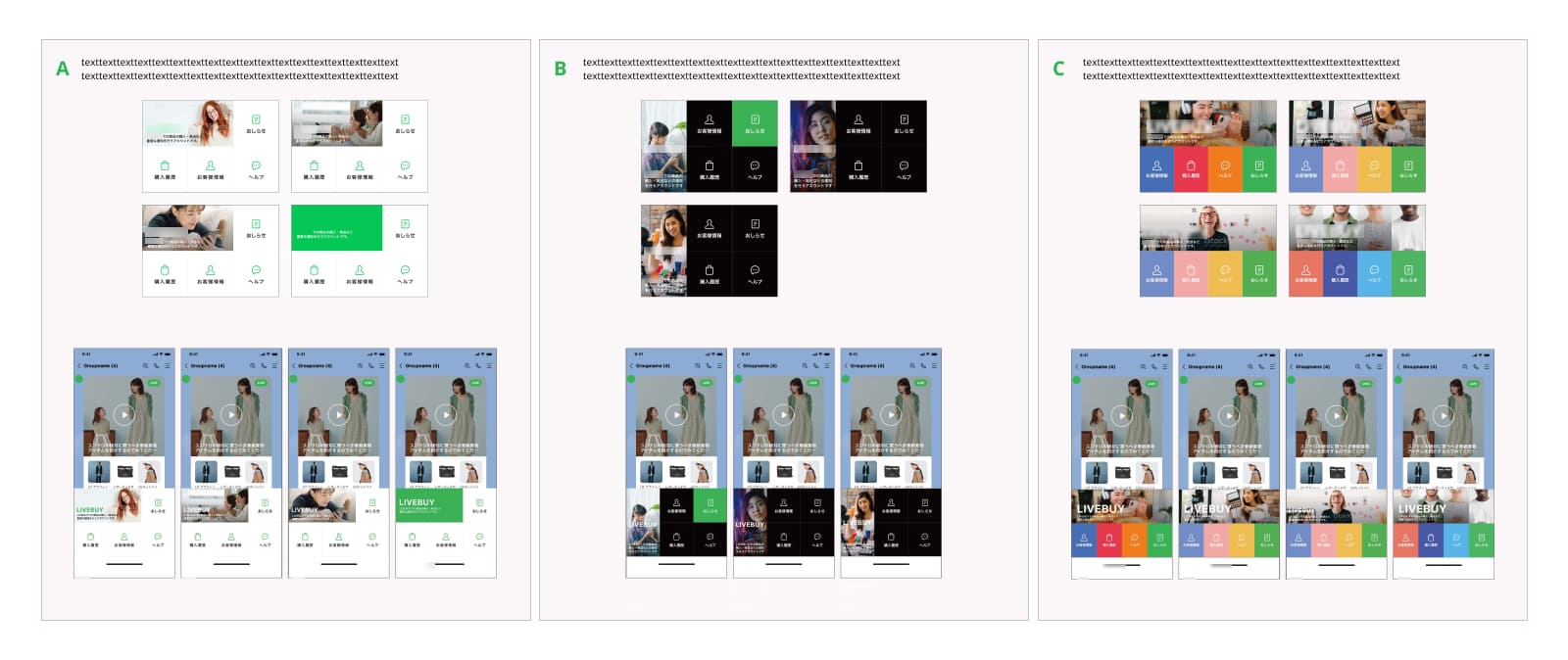
1. Design
- Developed multiple design patterns based on research findings (e.g., up to 20 CTA variations).
- Recommended prioritised options, supported by research-backed rationale.
2. Share
- Presented daily to designers in concise 30-minute sessions.
- Clearly explained rationale to enable quick, effective feedback.
3. Refine
- Iterated on design patterns based on feedback.
- Created visual proposals to support verbal communication in Agile sessions.
4. Finalise with stakeholders
- Facilitated sign-off from Product Owners and Managers.
- Handed over finalised designs to engineers for implementation.
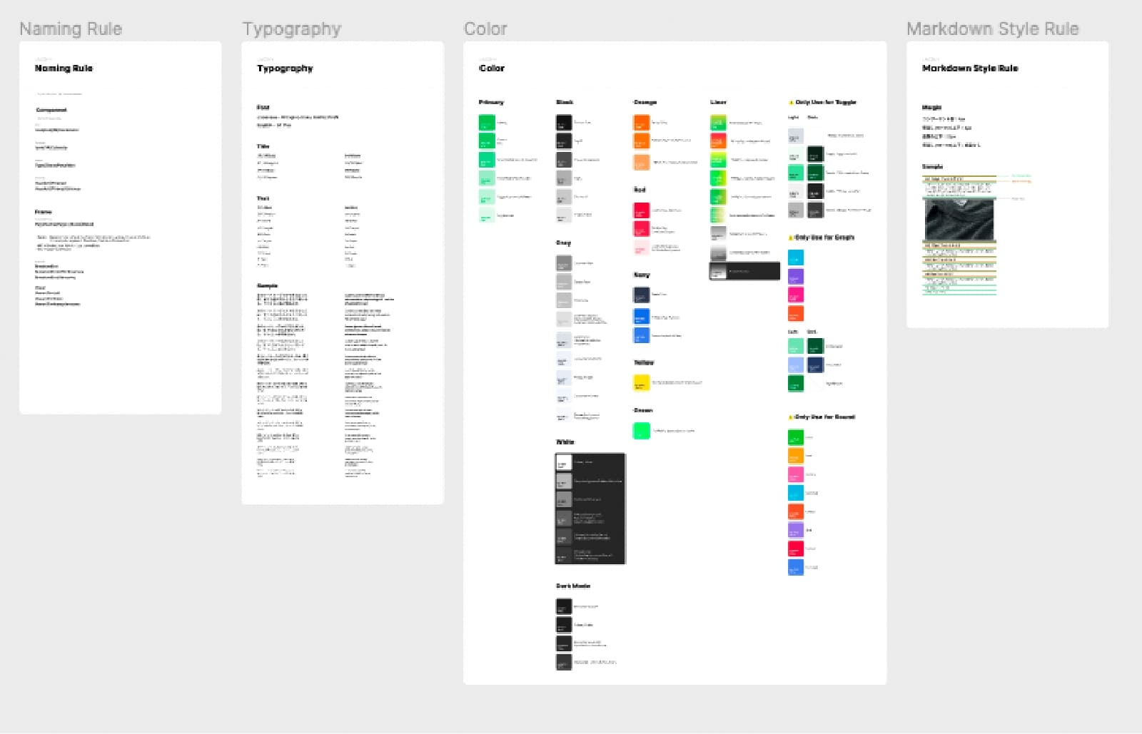
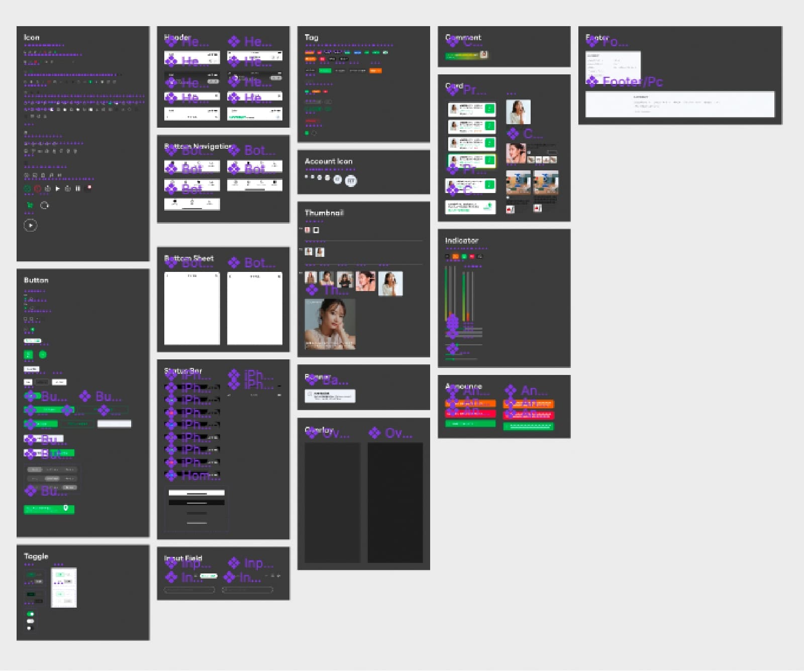
🧩 Design System
I built a reusable component library for the service that emphasised clarity, accessibility, and scalability while staying consistent with the design tokens and components across the ecosystem.
Design Solutions
Below are four core solutions that shaped the final experience:
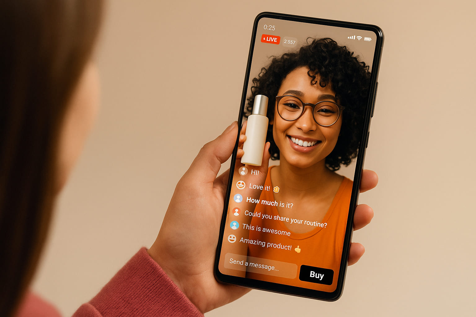
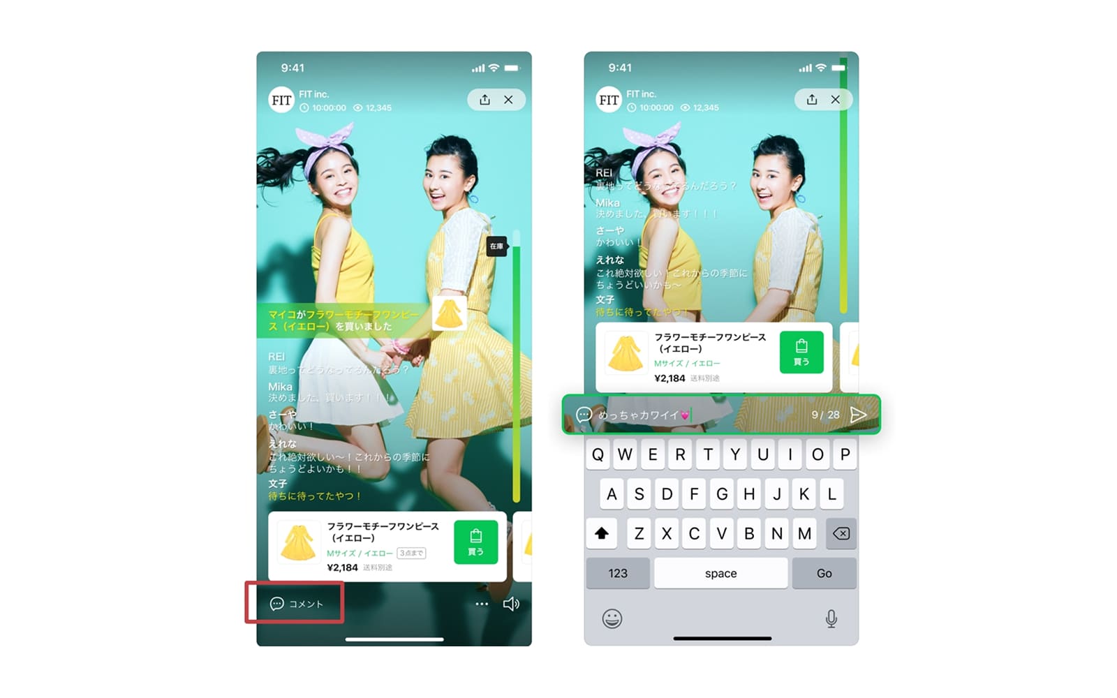
1. Inclusive live chat and purchase notification
Key Insight: Real-time interaction and visible reactions sustain viewer attention.
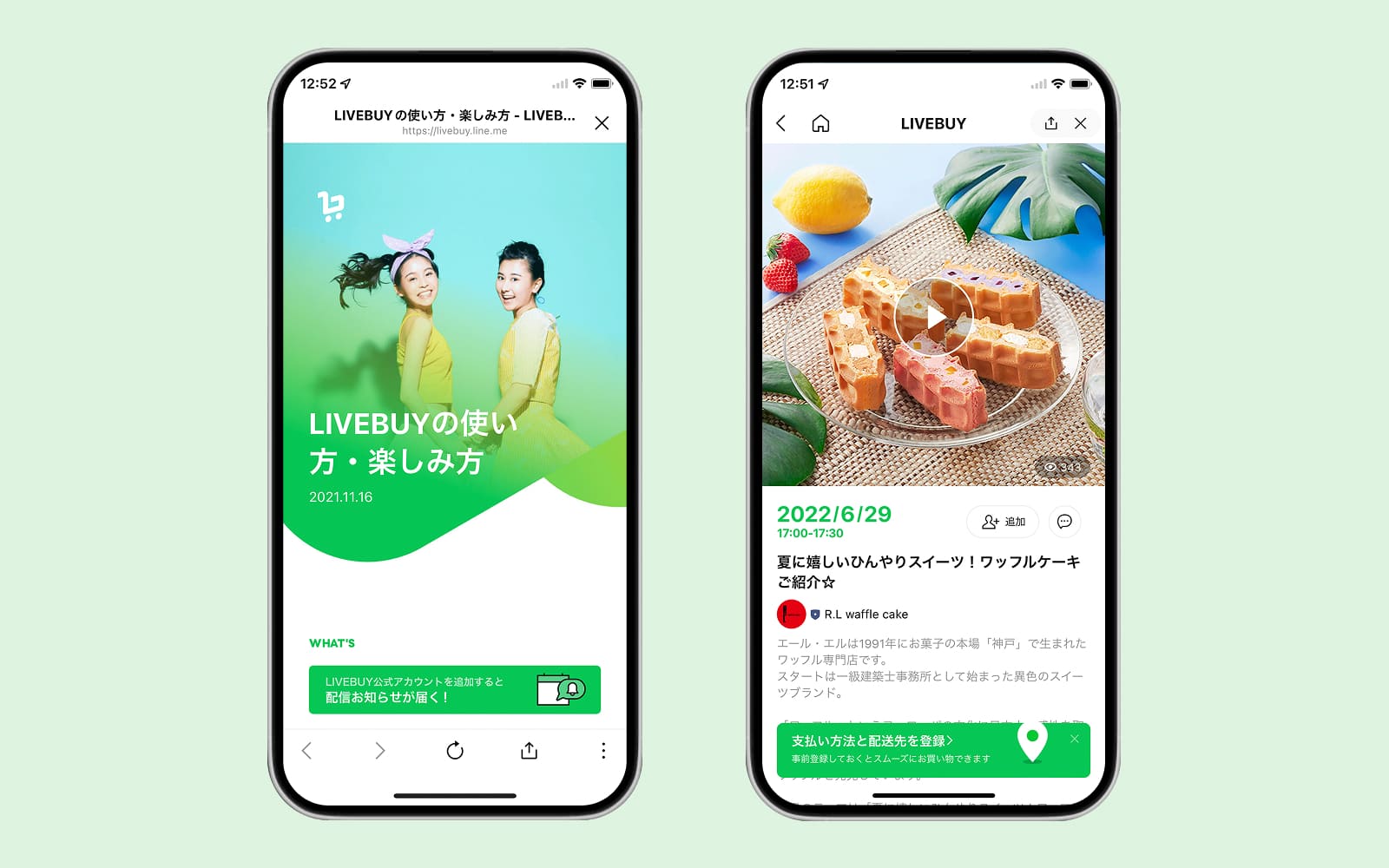
Solution: Integrated a live chat experience and purchase notifications that increase social proof and encourage impulse purchases.
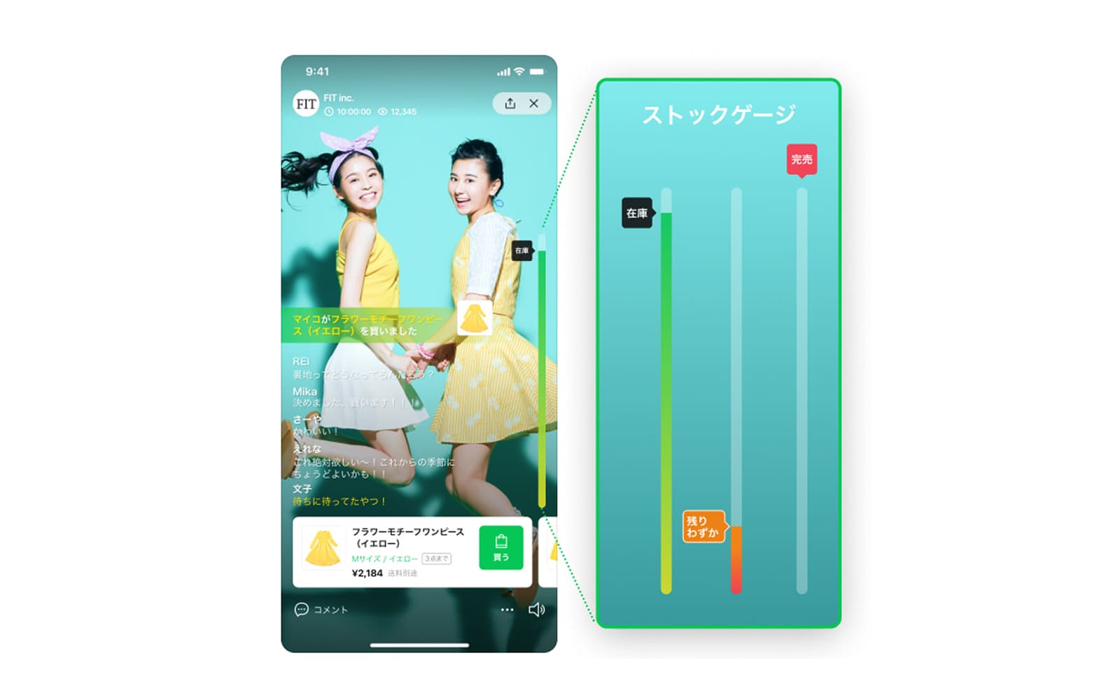
2. Transparent stock status & limited availability
Key Insight: Scarcity creates urgency, motivating quicker purchase decisions.
Solution: Visualised product availability with a clear stock indicator, boosting engagement and conversion.
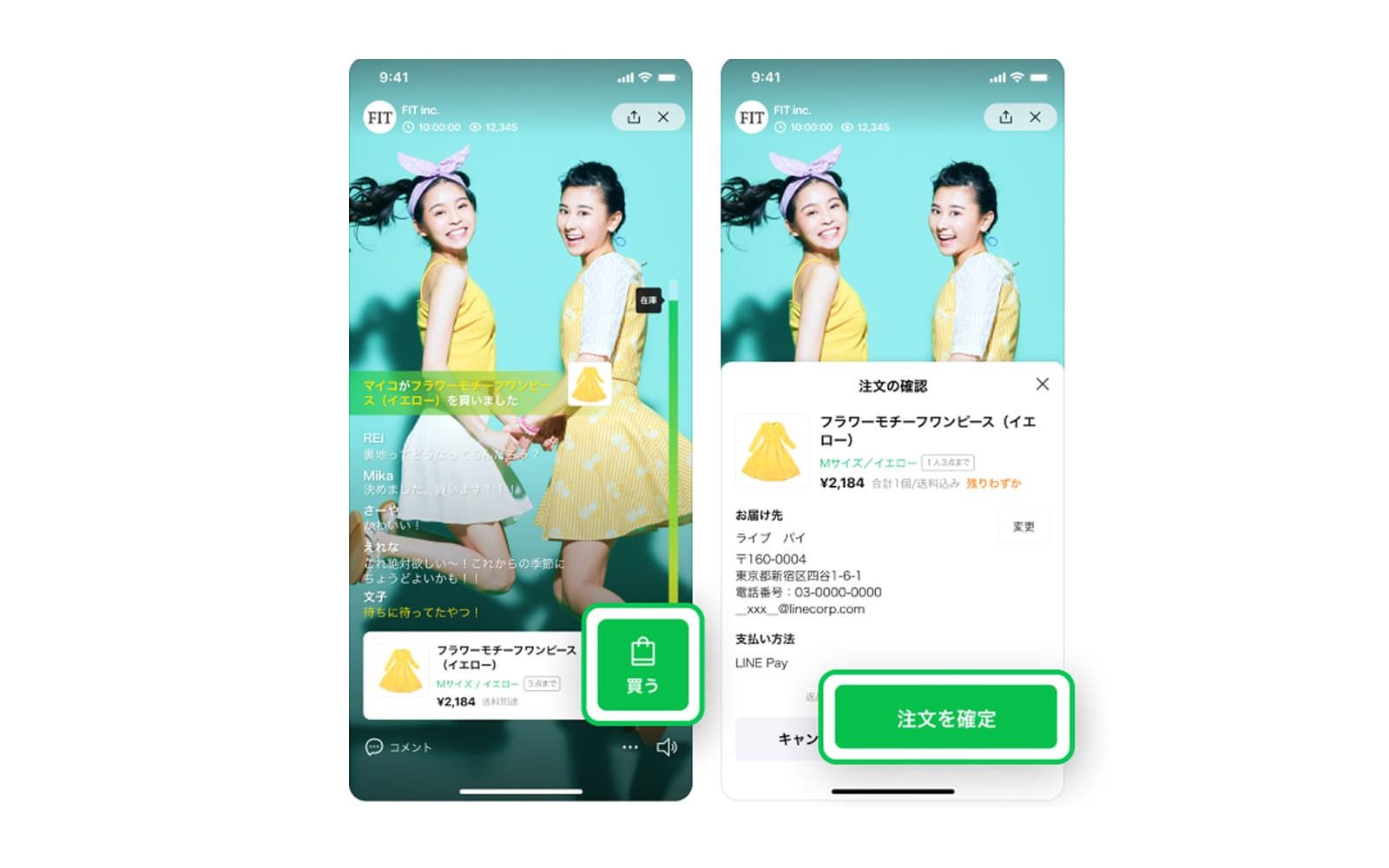
3. Simple checkout: Only 2 taps to buy
Key Insight: Any friction during checkout decreases conversion—especially during livestreams.
Solution: Streamlined the purchasing process to just two taps, highlighting key actions with a visible primary button.
4. UI Alignment with the ecosystem
Key Insight: Maintaining familiarity is key to user confidence and adoption in a new experience.
Solution: Designed an interface aligned with the ecosystem, interactive and bold enough to be exciting, yet clean and trustworthy as expected by Japanese users.
Results
While I’m unable to share confidential numbers, early internal reviews and post-launch evaluations showed positive trends in engagement, use of the built-in payment service, and smoother checkout completion. Stakeholders also highlighted the streamlined purchase flow and alignment with the ecosystem as key strengths of the experience.
Key Takeaway
Researching global live commerce platforms gave me valuable insight into cultural adaptation and localisation strategies.
I also learned how to operate smoothly in high-speed sprint cycles while collaborating with multiple stakeholders within a tight four-month timeline.
These challenges strengthened my flexibility, design decision-making, and ability to align stakeholders toward the same goal.